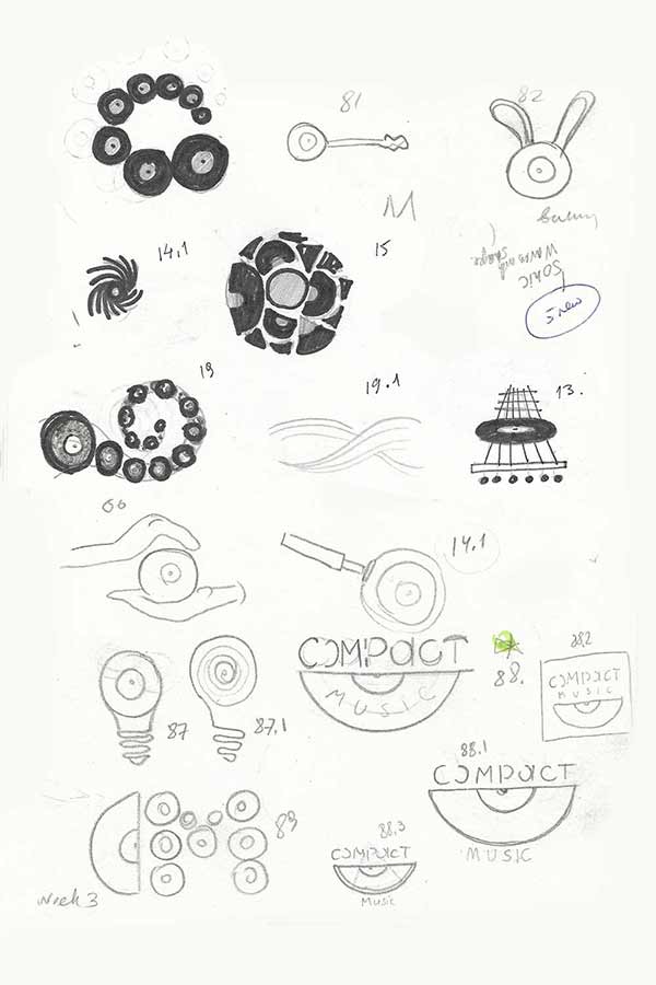
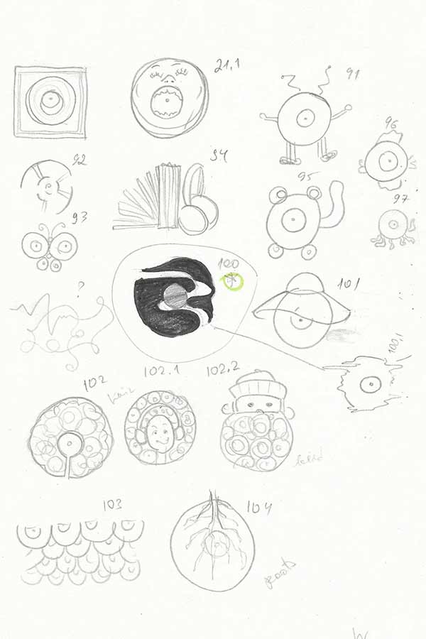
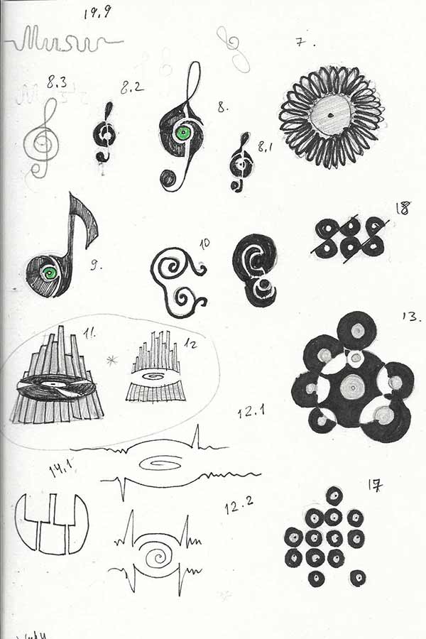
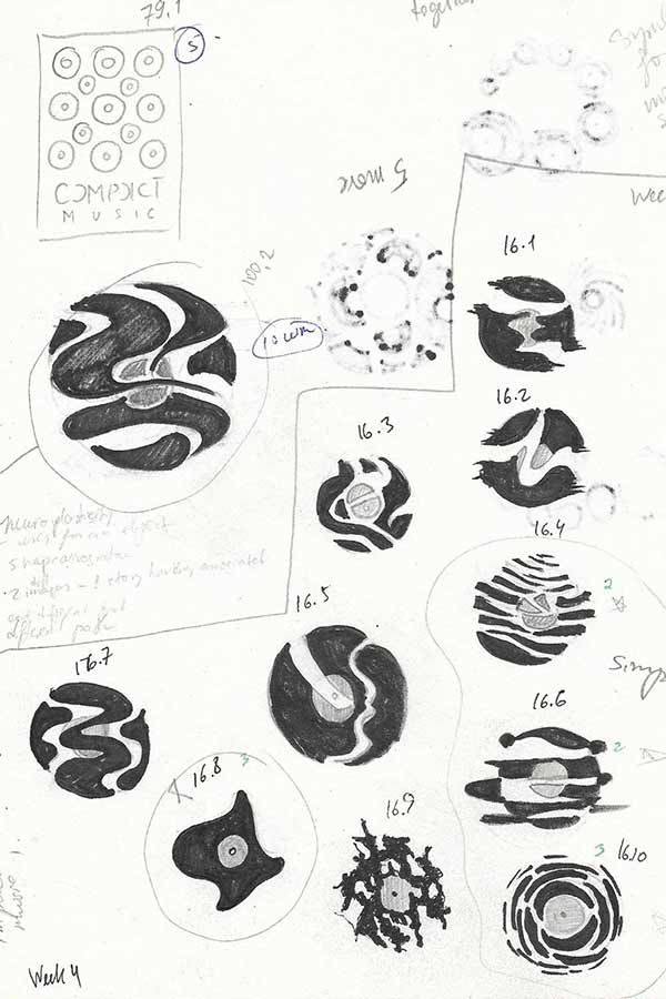
Logo concept
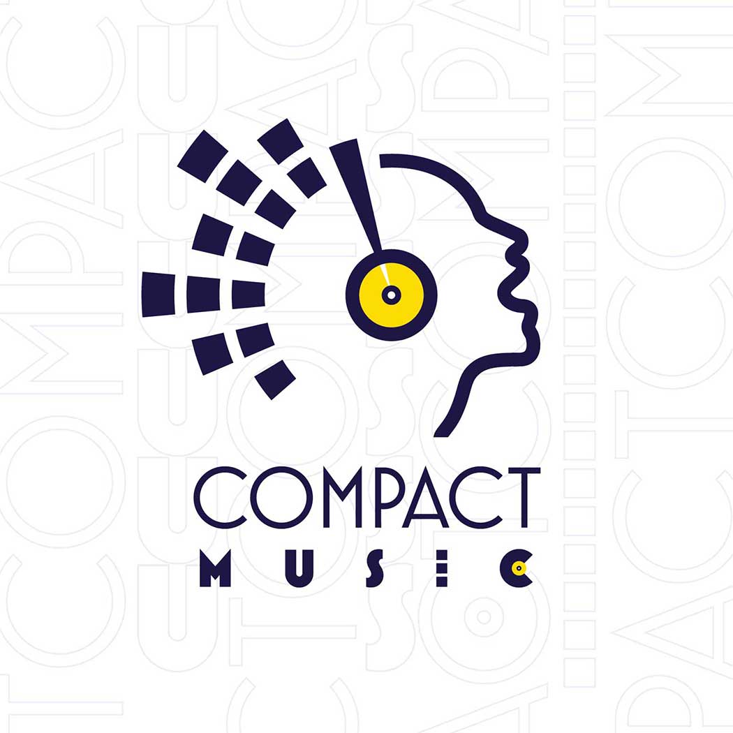
The Compact Music logo reflects a passionate and personal approach that customers come to appreciate from the record store. The Compact Music logo reinforces the notion that music connects to your soul and defines who you are, while the store is helping customers to get inspired and discover good music. This logo design will encourage the perceptions of inviting and personal approach that customers demand in the current music record store business.
Symbol
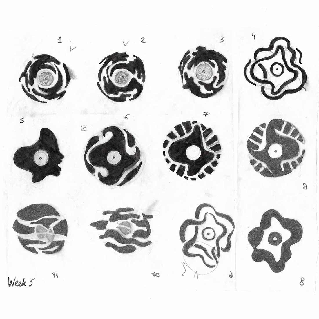
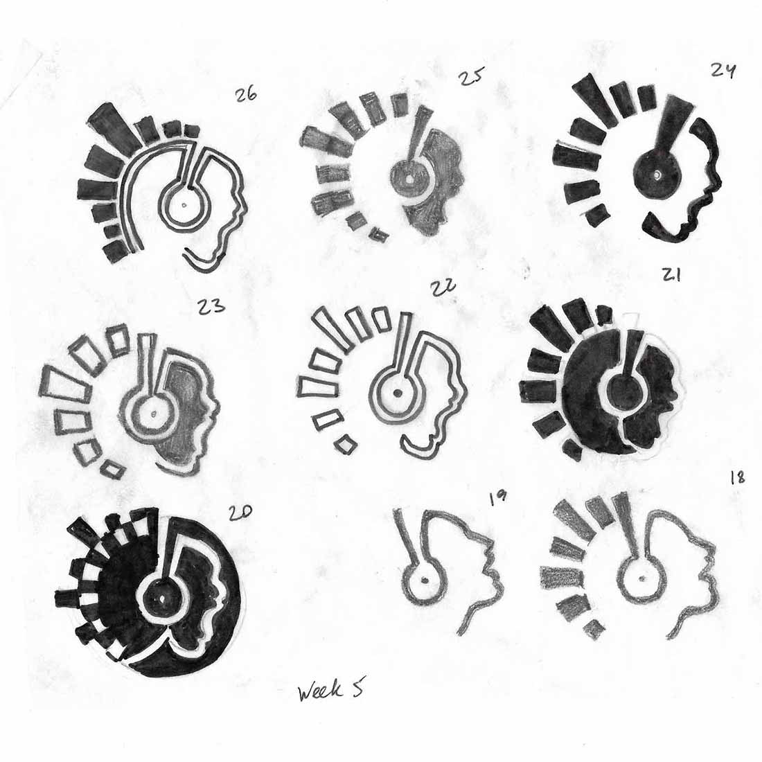
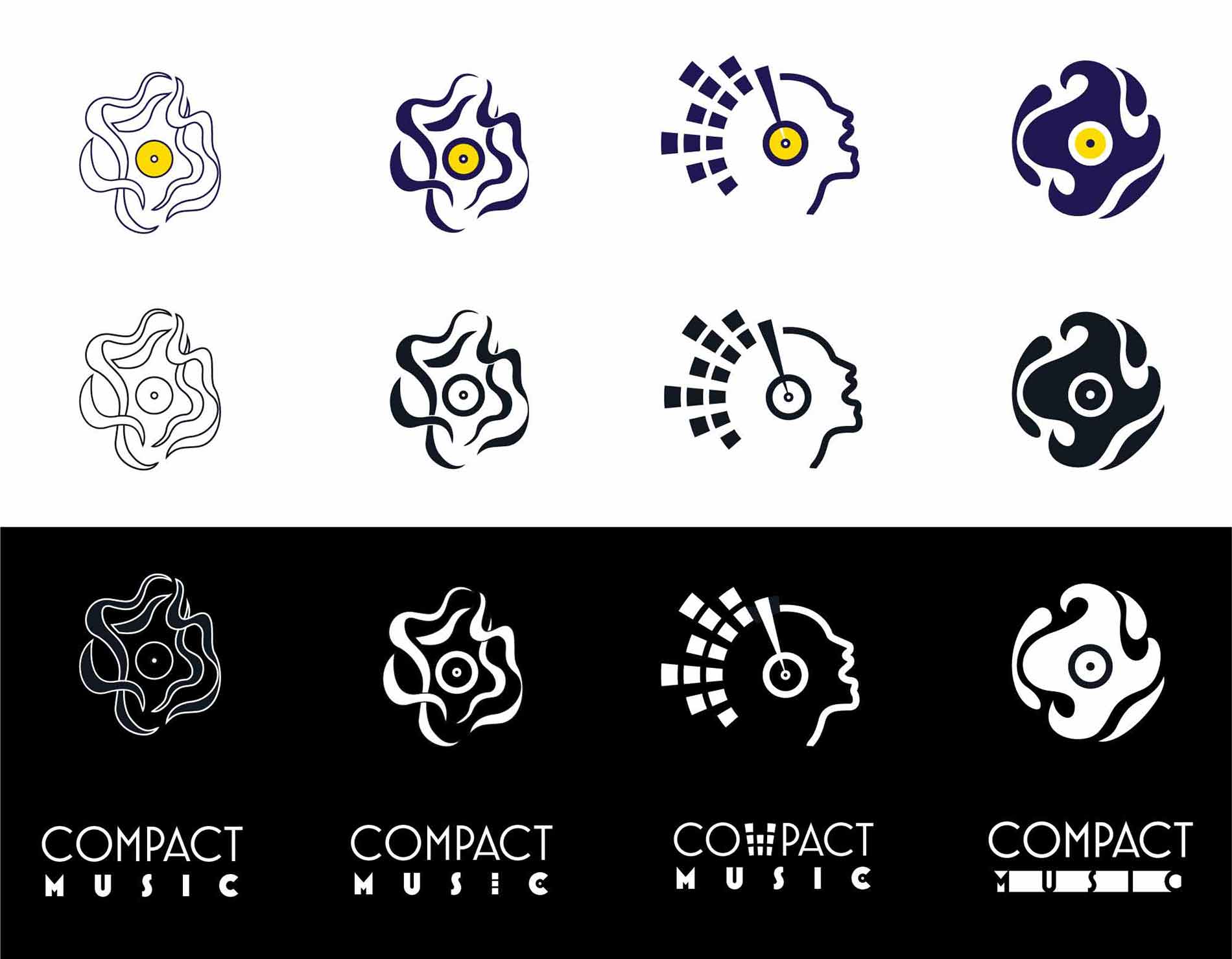
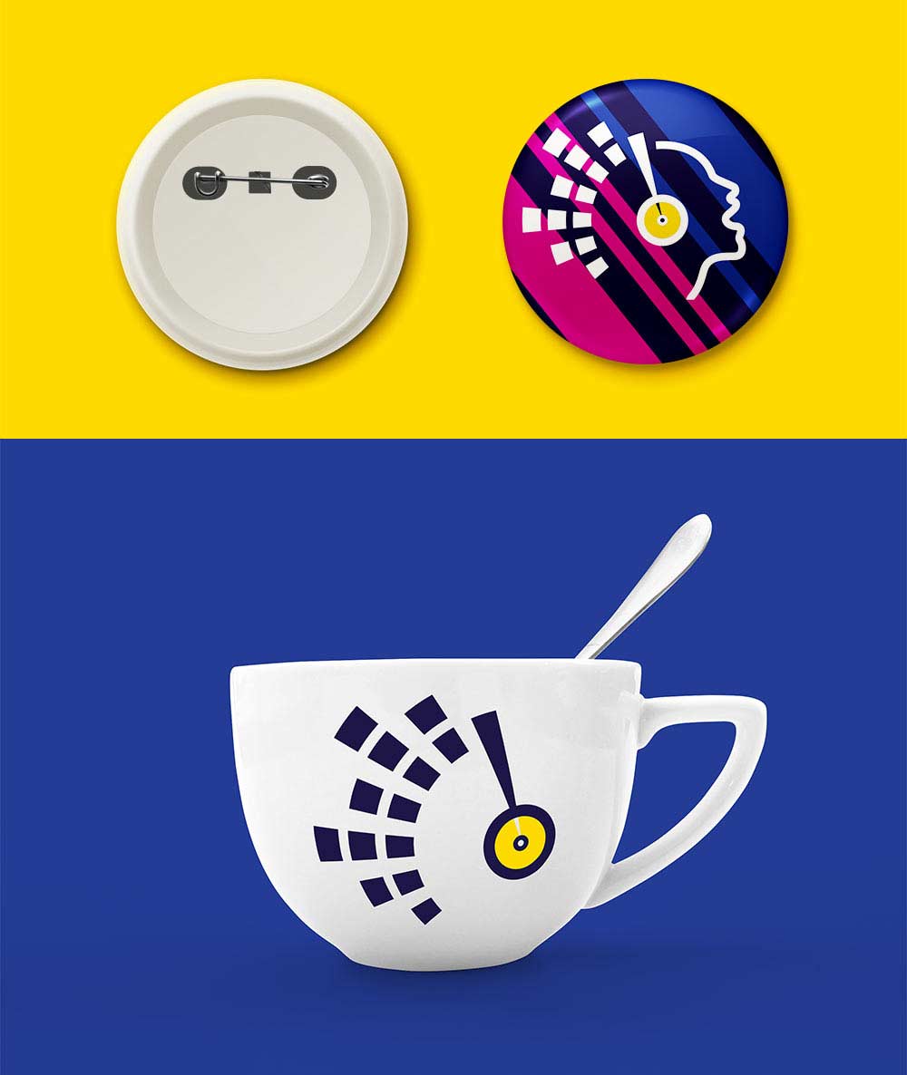
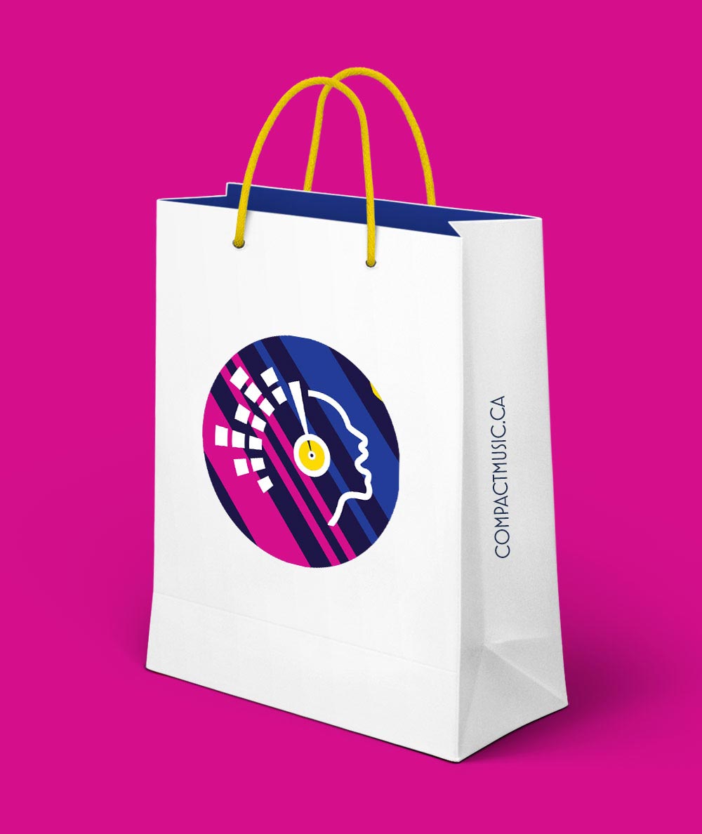
The graphic symbol resembles both a vinyl record and a person’s profile enjoying the music, which helps establish the nature of the business as well as the main product. The diversity of the graphic shapes helps reinforce the versatile and dedicated approach that Compact Music uses when dealing with their customers. And implies a vast collection of music featuring at the store as well as the fact that everyone is welcome to come and receive friendly advice from the knowledgeable team.
Colours
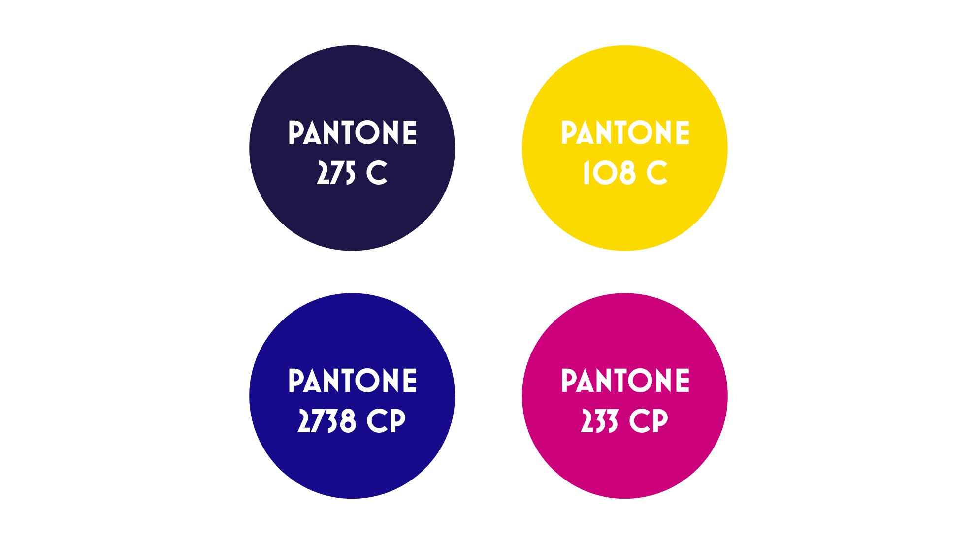
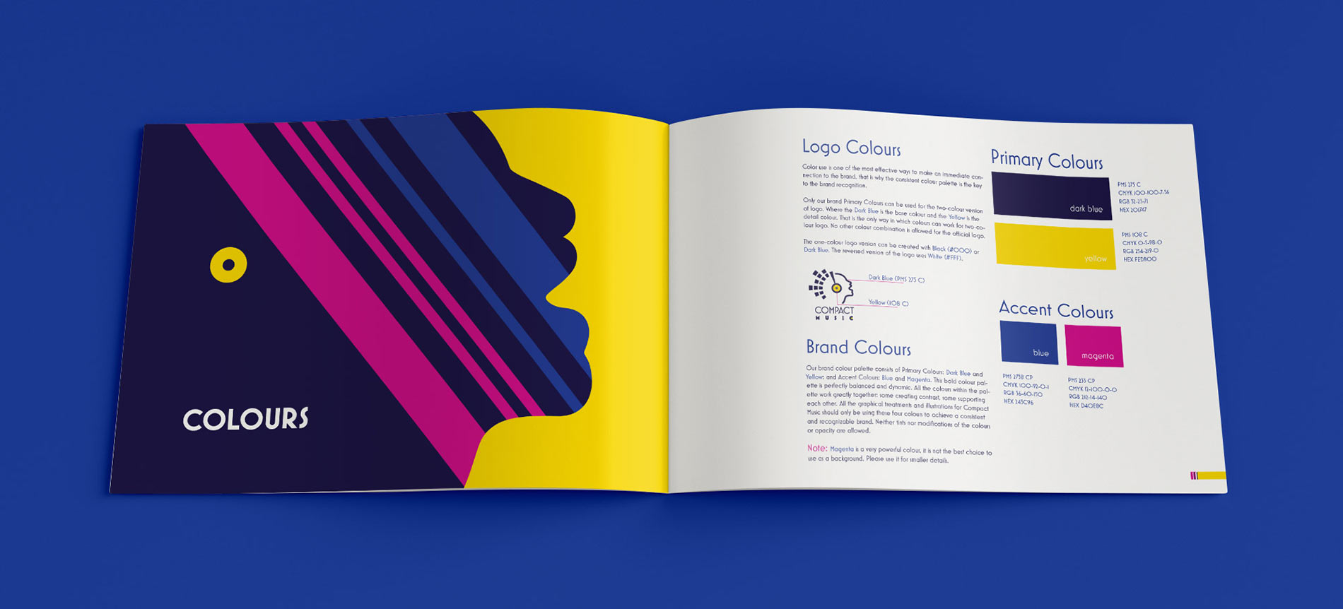
The colour choices help emphasize openness with the mix of optimism and emotions that Compact Music puts into their customer service and everyday life.
Font
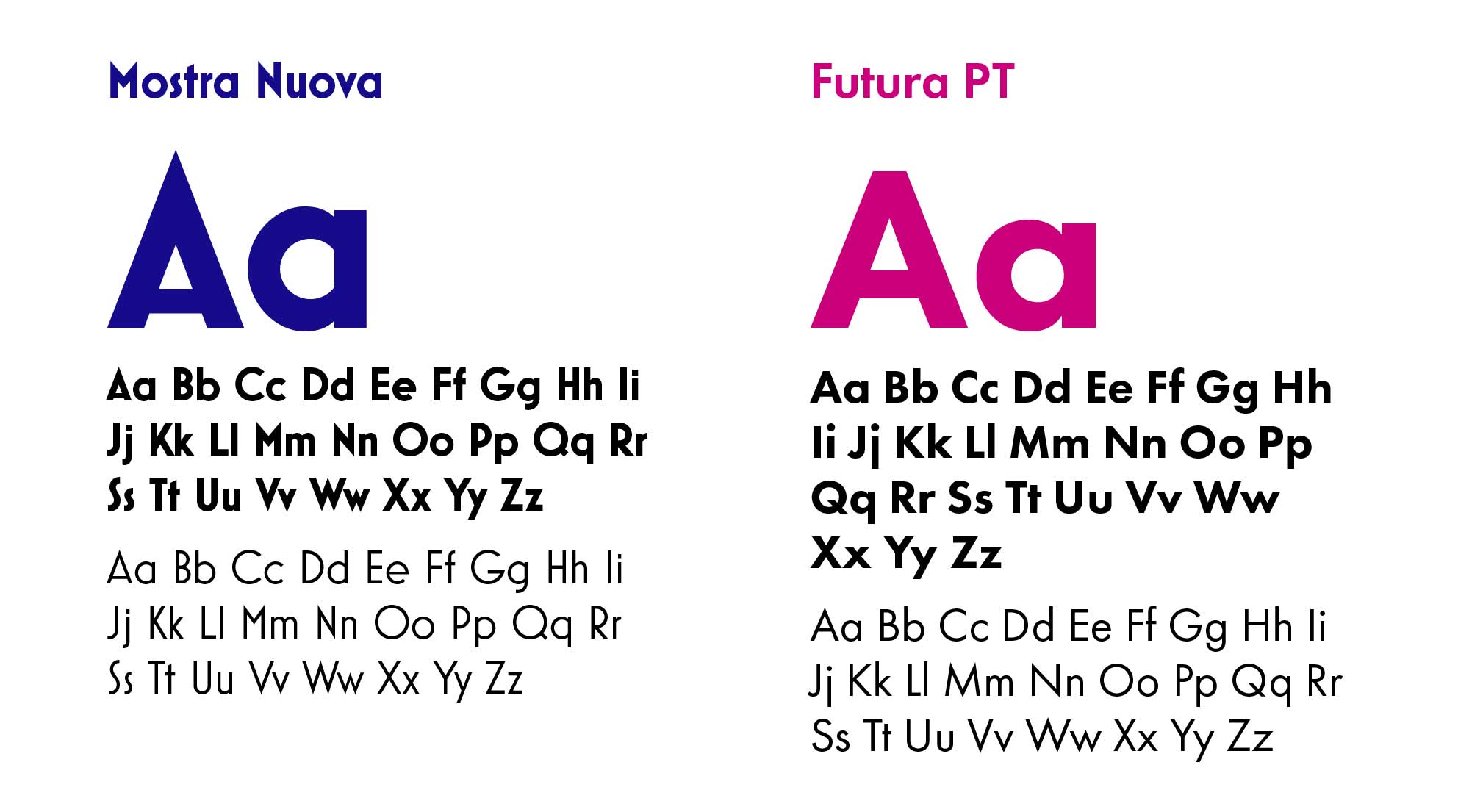
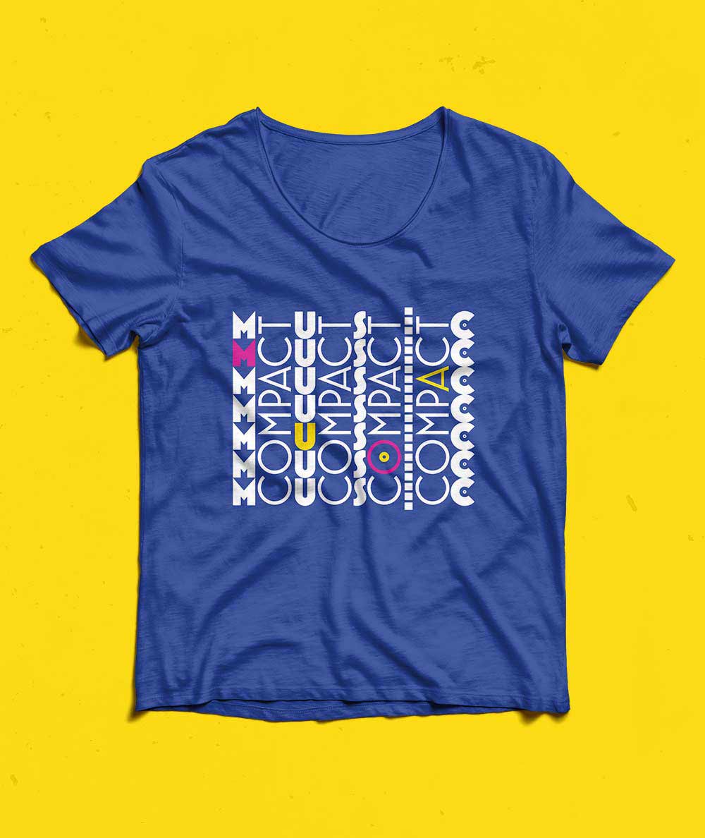
The font choice creates a connection between past and present. This connection helps express the business’s respect and admiration for the music and artists of previous decades as well as their passion for discovery of new good musicians of today. This admiration and passion implies that Compact Music Store helps guide their clients with expertise and open-mindedness through the world of music.
Design versatility
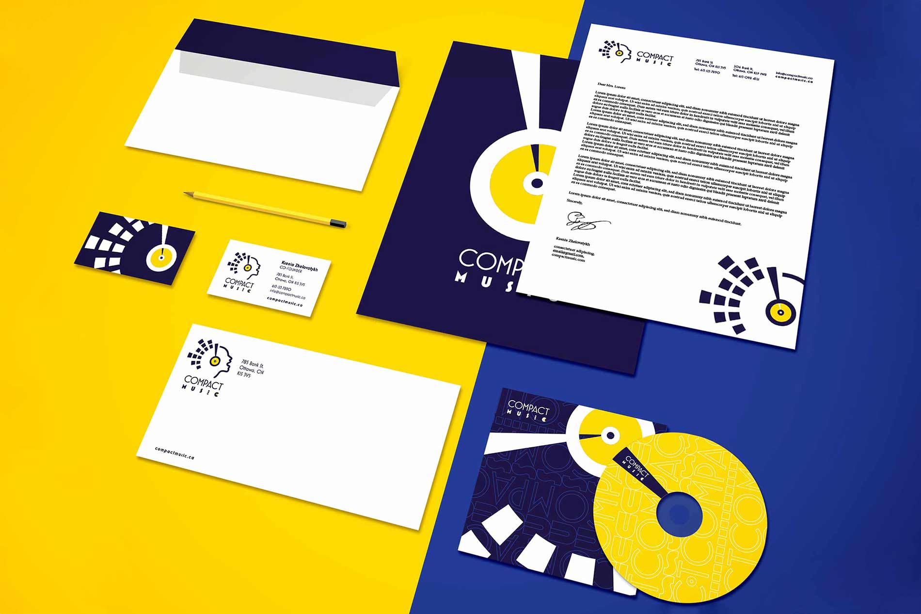
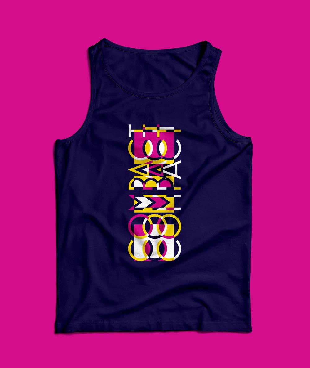
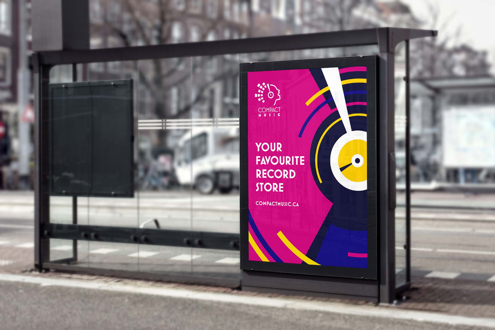
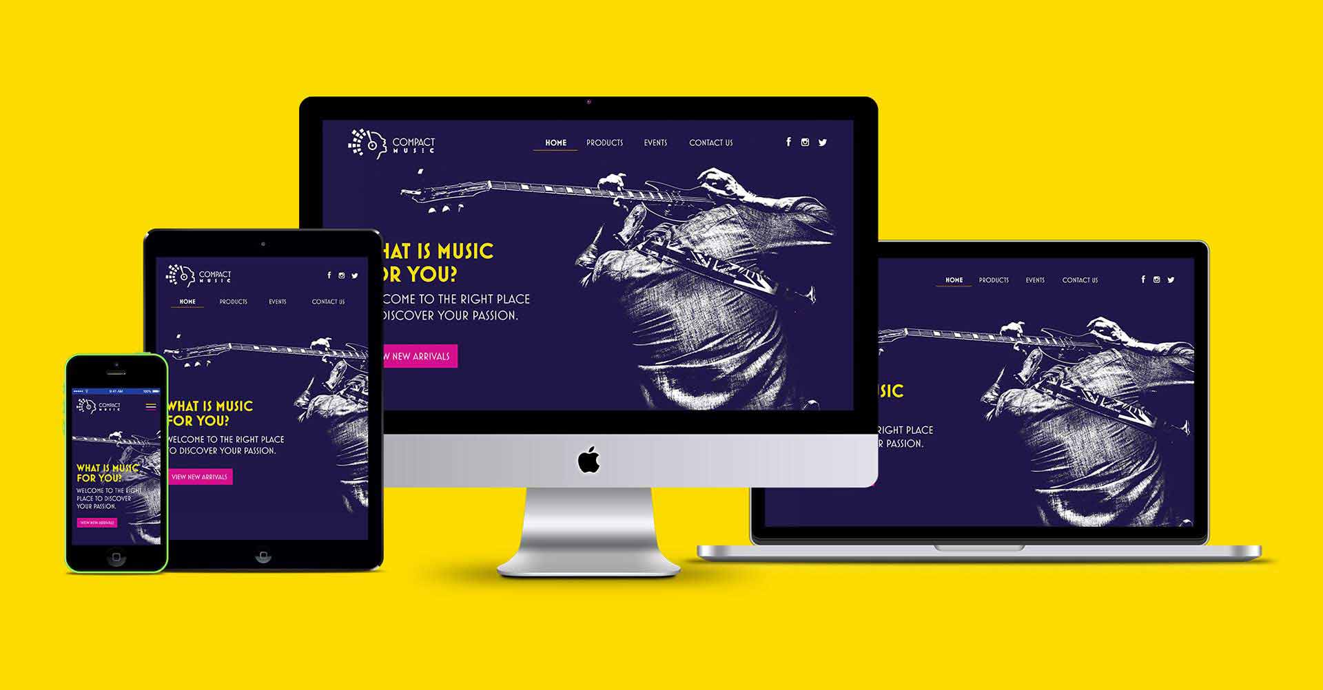
The look and feel of the symbol extends to the wordmark reinforcing the brand and making it easy to use it for different layouts. In the client’s case: horizontal sign for the store front and vertical promotional signs for the future store in the mall.
